
Choosing your wedding invitation colour palette is one of the most exciting parts of wedding planning. It’s the first glimpse your guests will have into the atmosphere and style of your big day. Whether you're planning a lavish Dubai wedding, an intimate UK wedding, or a dreamy destination wedding, your invitation colours should reflect your personal style, cultural influences, and the overall vibe of your celebration.
At Ananya Cards, we understand how important it is to create stationery that is as unique as your love story. If you need help bringing your vision to life, we’d be delighted to design something truly special for you. Let your colours speak volumes and set the perfect tone for your unforgettable day.
If you’re feeling overwhelmed by the options, don’t worry! Here’s a step-by-step guide to help you create a colour palette that feels as unique and meaningful as your love story.

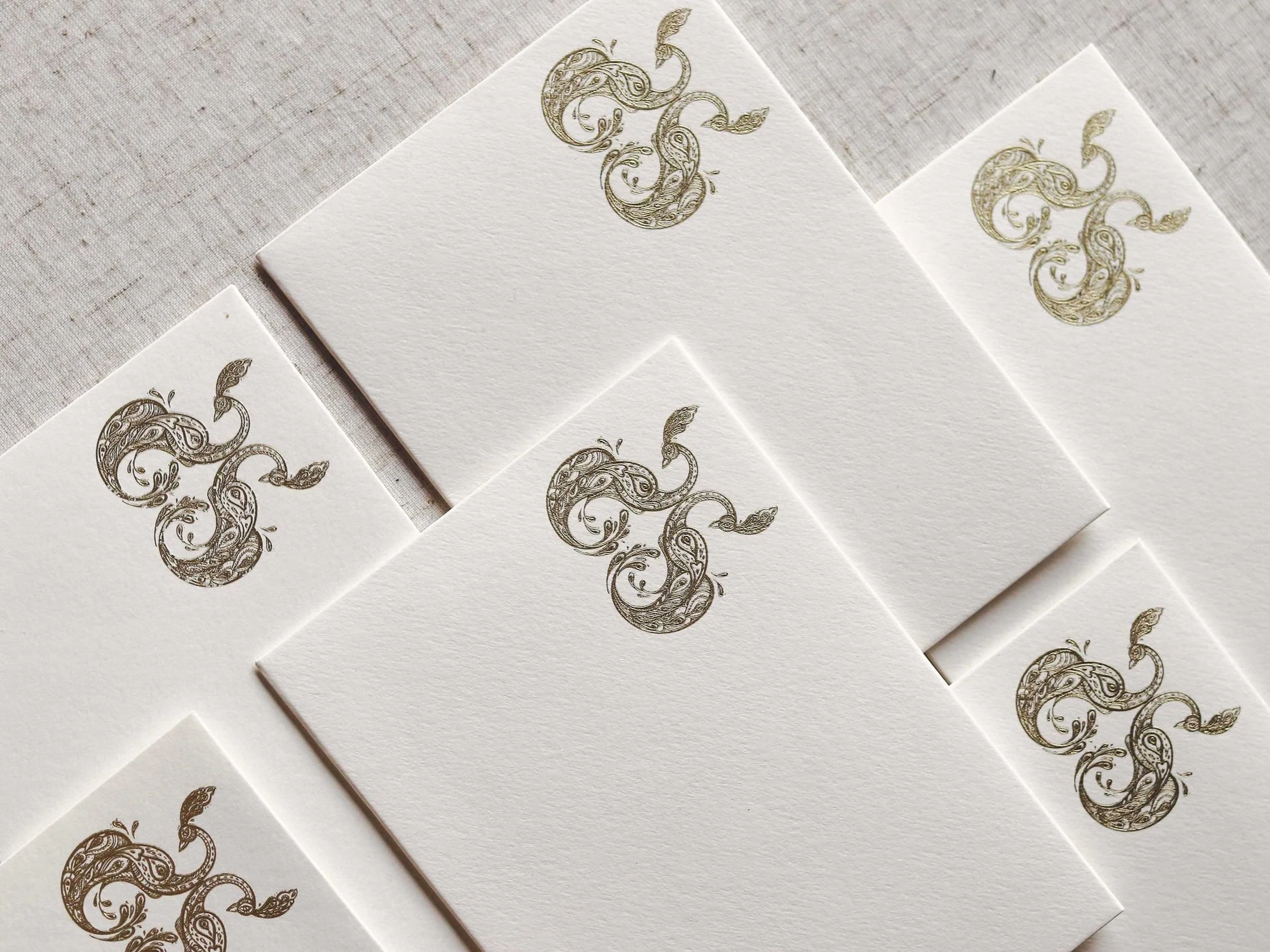
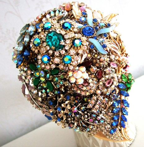
Photo: Martina H
Start with Your Wedding Theme and Venue
Your wedding theme and venue are the perfect starting points for choosing your invitation colours. Are you having a grand celebration in Dubai with opulent details, a charming countryside wedding in the UK, or a sun-soaked destination wedding on a beach in Santorini? Each setting naturally suggests a different mood and palette. For example, for a Dubai wedding, gold and ivory with intricate Arabic-inspired patterns can create a luxurious first impression. For a desert celebration, earthy tones like terracotta, sand, and muted greens echo the natural landscape. For a beach destination wedding, ocean blues and sandy neutrals feel fresh and timeless. A vineyard wedding in Tuscany could inspire rich greens, wine reds, and warm terracottas.
By aligning your invitation colours with your theme and venue, you’ll create a cohesive look that flows effortlessly from your invitations to your big day.

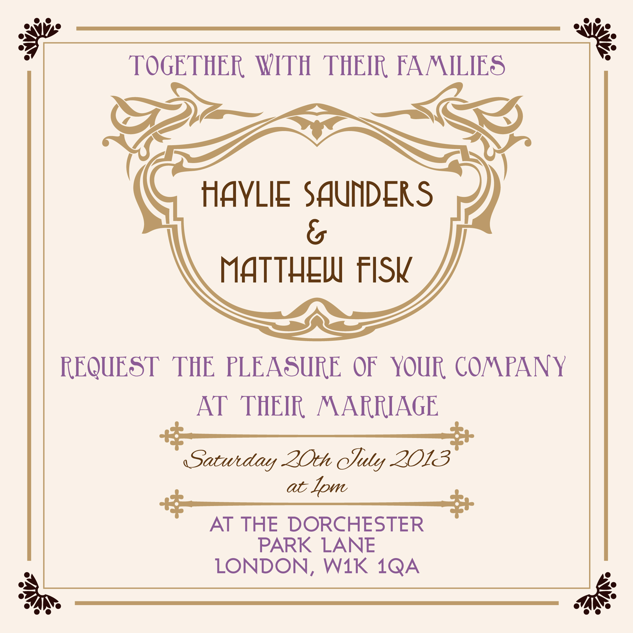
Photo: Shades Production
Draw Inspiration from Your Personal Story
Your invitations are an opportunity to share a piece of your story. Think about places, memories, or symbols that hold special meaning to you as a couple. Did you fall in love in the vibrant streets of Marrakech? Terracotta and jewel tones could capture that energy. Did you say "yes" under a golden sunset? Warm amber and soft peach might be ideal.
Infusing your personal story into your colour palette makes your invitations not only beautiful but also deeply sentimental.

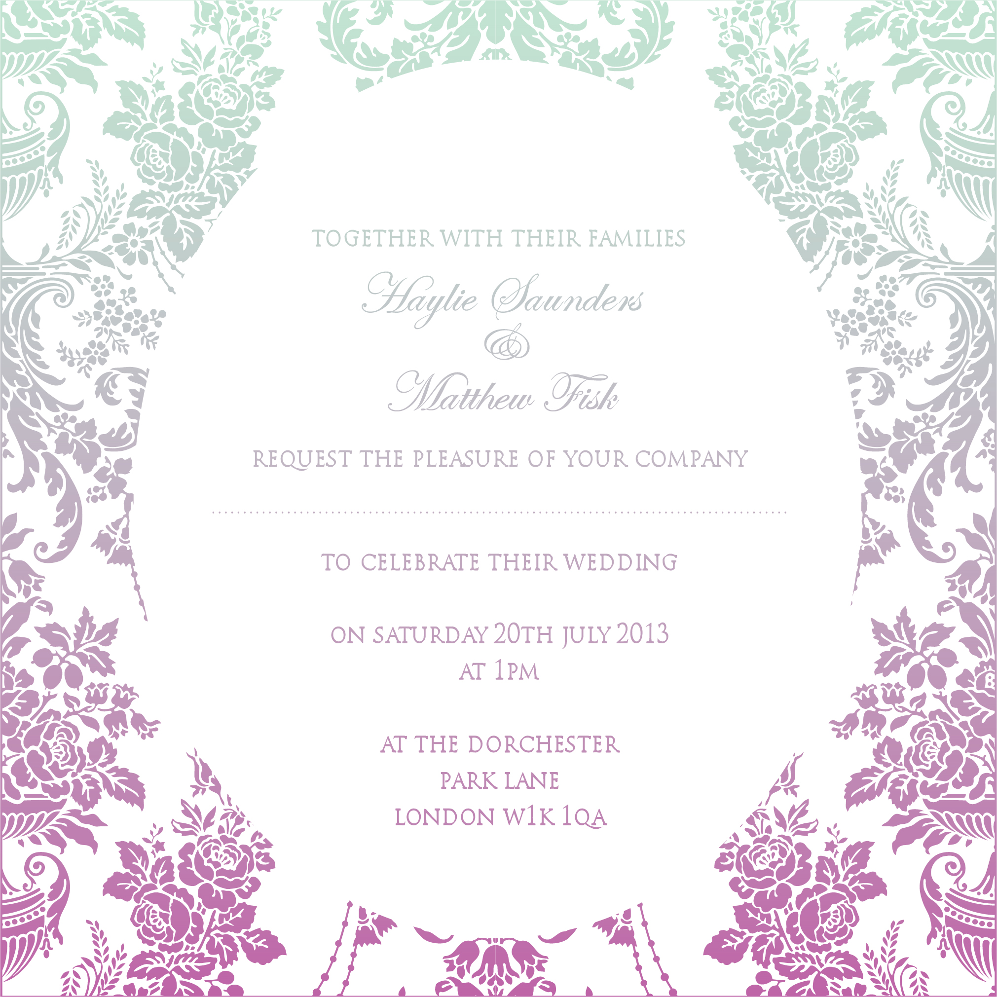
Photo: Valery Studio
Consider the Season
The season of your wedding can naturally influence your colour choices. Seasonal tones feel effortless and timeless.
Suggestions by Season:
Spring: Soft pastels like blush pink, sage green, and buttery yellow.
Summer: Bold corals, sunny yellows, and ocean blues.
Autumn: Rich burgundy, burnt orange, and deep plum.
Winter: Icy blues, silver, and warm metallics like gold or copper.
While seasonal colours are a great starting point, don’t feel restricted. Your wedding day should reflect your personality, no matter the season.

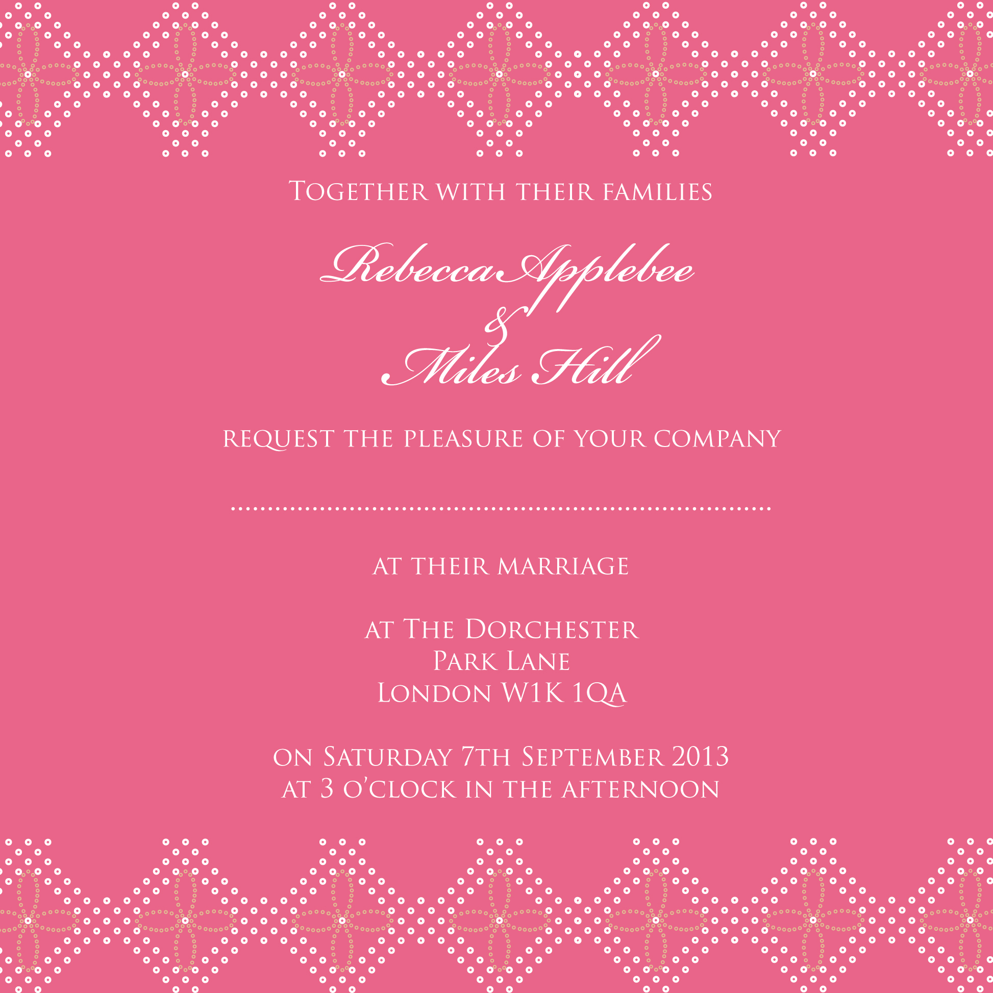
Photo: Elizabeth Mitova Photography
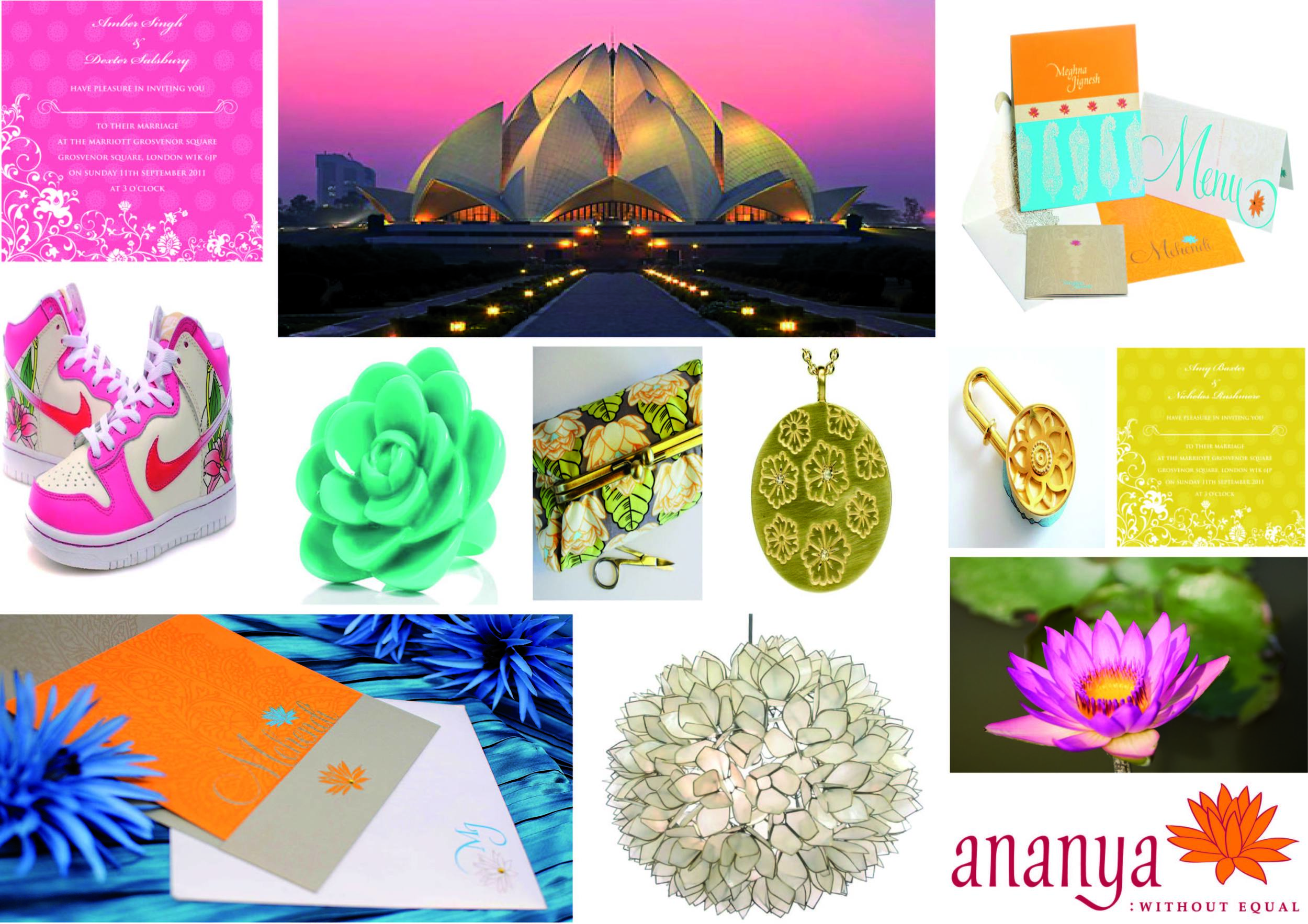
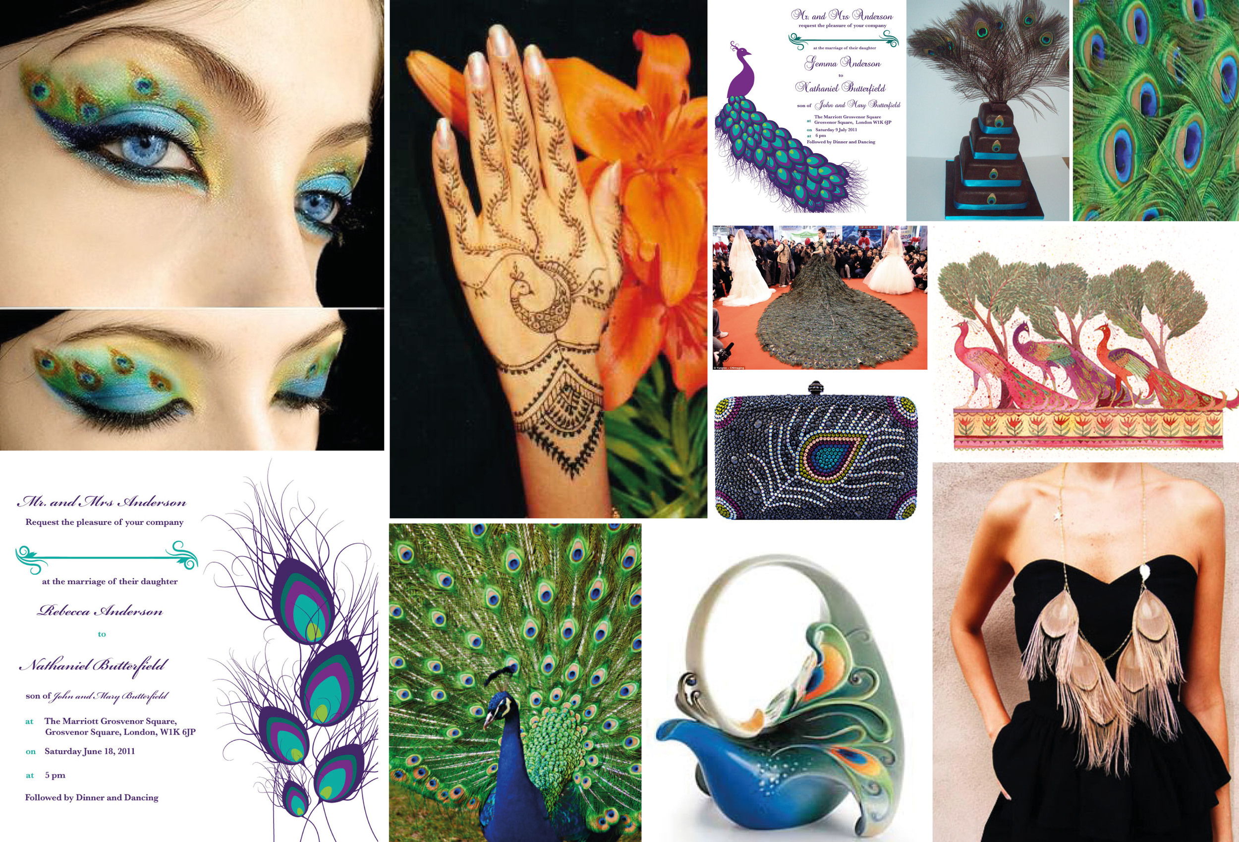
Reflect Cultural Elements
For multicultural weddings, blending traditions through colour is a meaningful way to celebrate your heritage. For example, at Indian Weddings, bright hues like marigold yellow, fuchsia pink, and peacock blue symbolise joy and celebration. Pair these with neutrals for balance.
Blending colours from both cultures into a modern design is a beautiful way to honour your heritage while creating something uniquely yours.
Balance Bold and Neutral Tones
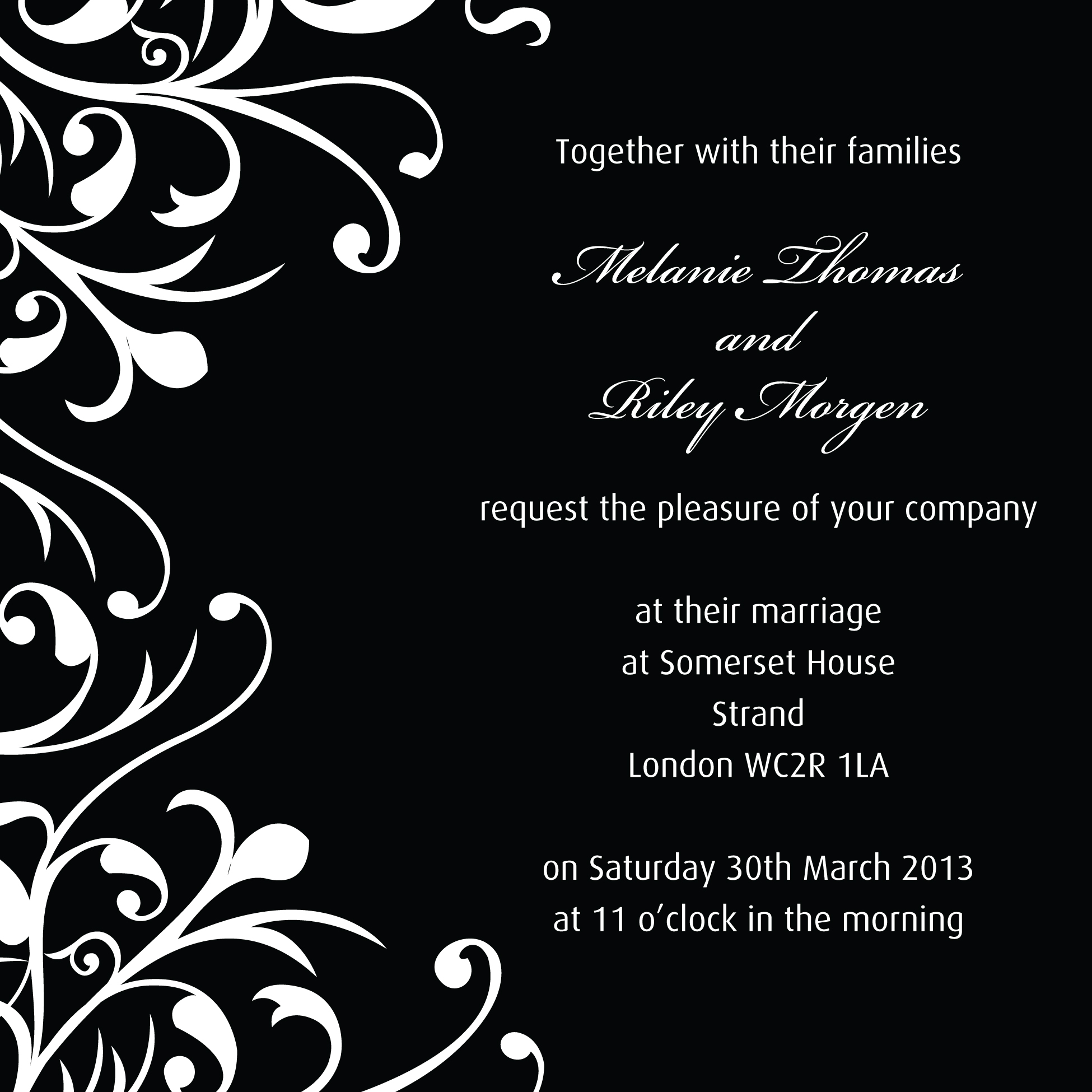
Striking the right balance between bold and neutral shades is key. Bold colours can make a statement, but pairing them with softer tones ensures sophistication. For example, a Dubai wedding, deep plum paired with pearl white and champagne gold feels opulent. In a UK wedding, navy blue combined with dusty rose adds a modern twist to a classic palette.
A well-balanced palette often includes:
Dominant Colour: The main shade that sets the tone.
Secondary Colour: A complementing hue for depth.
Accent Colour: A contrasting pop for added drama.
Prioritise Readability
While bold or unusual colour combinations are exciting, readability should always come first. Ensure that your text is clear and legible against the background.
Tips for Readability:
Use dark text on light backgrounds or light text on dark backgrounds.
For pastel or metallic details, consider using borders or layering colours for clarity.

Play with Texture and Finishes
Colour isn’t just about ink - it’s also about texture and finish. The type of paper and printing technique can elevate your chosen palette.
Examples:
Velvet paper with deep emerald ink creates a luxurious effect.
Handmade cotton paper with soft blush tones feels delicate and romantic.
Gold foil accents add glamour, especially for luxury weddings.
Letterpress printing adds subtle dimension for a timeless touch.
Textures and finishes bring depth and sophistication to your invitations.
Seek Professional Guidance
Designing wedding stationery is an art. At Ananya Cards, we specialise in bespoke invitations that perfectly capture your unique style. We love collaborating with couples to blend colours, patterns, and finishes into designs that feel completely personal.

Photo: Elizabeth Mitova Photography
Final Thoughts
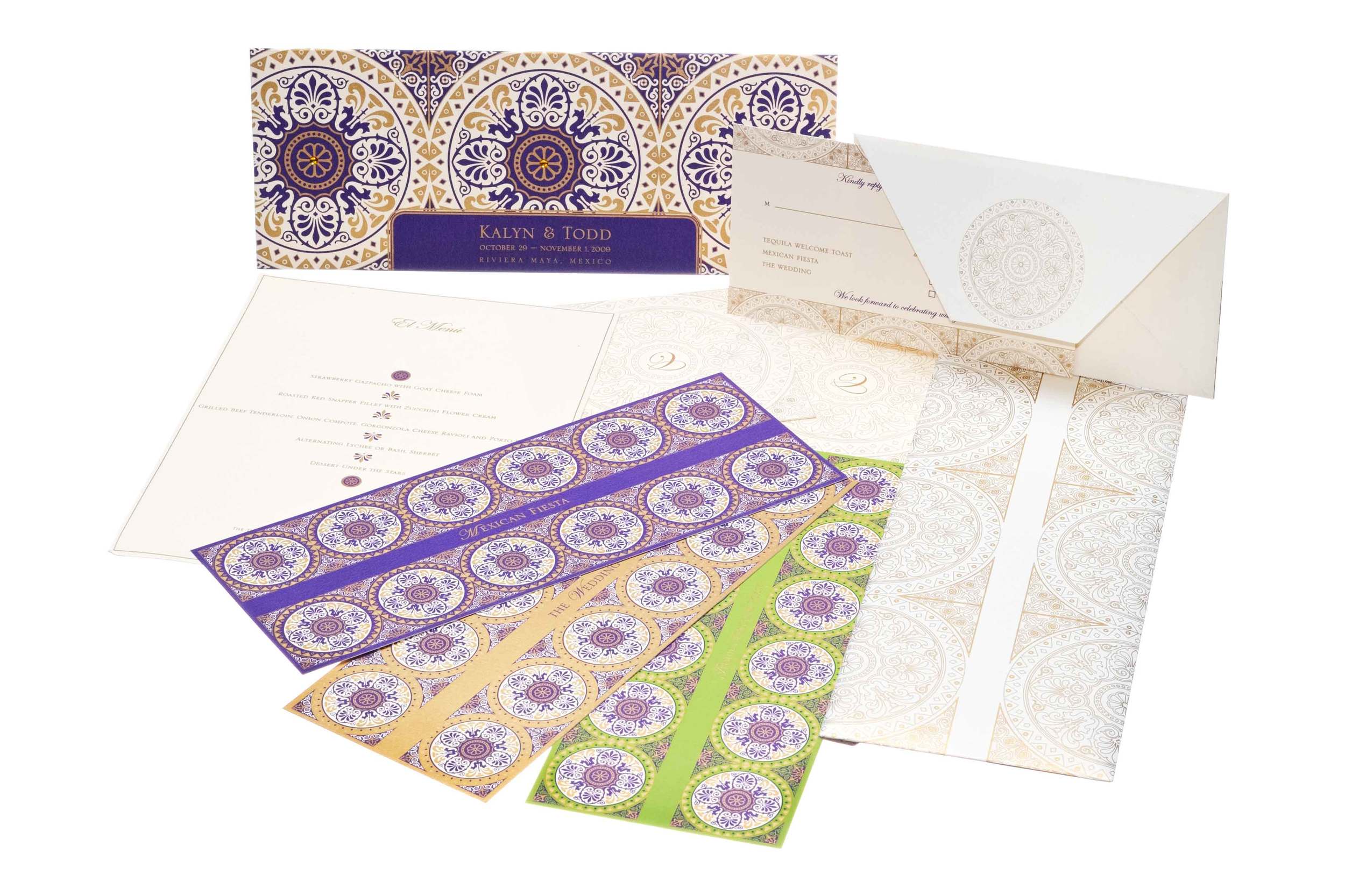
Choosing the perfect colour palette for your wedding invitations should be joyful, not stressful. There’s no right or wrong choice - it’s about what feels meaningful to you. Whether you love soft neutrals, bold jewel tones, or unexpected combinations, your invitations should tell your story. One of our couples planning a destination wedding in Morocco chose rich terracotta with gold foil to mirror the warm tones of Marrakech. A couple hosting a Dubai wedding selected crisp white and gold invitations with Arabic calligraphy to reflect their cultural heritage and the city’s elegance.
Whether you're planning an extravagant Dubai wedding, a classic UK wedding, or a romantic destination wedding, we’d love to help you create something truly unforgettable.
At Ananya Cards, we understand how important it is to create stationery that is as unique as your love story. If you need help bringing your vision to life, we’d be delighted to design something truly special for you.
Let your colours speak volumes and set the perfect tone for your unforgettable day.
We hope this article has been a helpful and inspiring as you plan your wedding. For more guidance, check out our blogs on wedding invitation timelines and wedding stationery tips, filled with useful advice.
If you’re ready to create sophisticated, unique, and culturally inclusive stationery that reflects YOUR personality – we’d love to hear from you!
Until next time,